Curious About Marcel Wanders
04/05/2017
Words: Polly
Photos: Curious Coco. Marcel Wanders Studio
“..advocating a more romantic and humanistic design thinking. Respecting the past and the diversity of cultures, Marcel Wanders develops a contemporary language that is personal yet a catalyst for the post-post-modernist era we call the “Contemporary Renaissance of Humanism” (marcelwanders.com).
Enter the parallel universe that is the wonderful design world of Marcel Wanders. His unique skill lies in creating an experience; that is his signature style – designs with a sense of theatre, fantasy and escapism. So when I got the opportunity to stay at the Mondrian Hotel on Miami’s South Beach, full of promise as beacon for good times and a great crowd, it was a dream opportunity, a chance to put a big ole tick on the designers bucket list. Designed by a world renowned designer in a place I love, how could it fail?Alas like a dream, I woke up.
Wanders aims to “create a reality in which designer, craftsperson and user feel welcomed and embraced” in a world where demi-Gods, design authorities, and divas exist. I very much like this inclusive, anti-establishment design ethos, however, once the novelty of the ‘modern Sleeping Beauty’s castle’ design wore off I’m not sure it achieved ‘welcoming’. Perhaps it was my over excitement at staying there that set my expectations too high, or the presence of the Wilhelmina Models Agency on the 3rd floor and their model’s accommodations on the premises, part of the collection of privately owned residences, that made the stream of ‘guests’ seem detached, or perhaps it was the interior design that just didn’t hit the mark for me? Whatever it was, the vibe was fake somehow, even when overloaded with atmosphere on the weekends as the cool crowd reveled poolside.
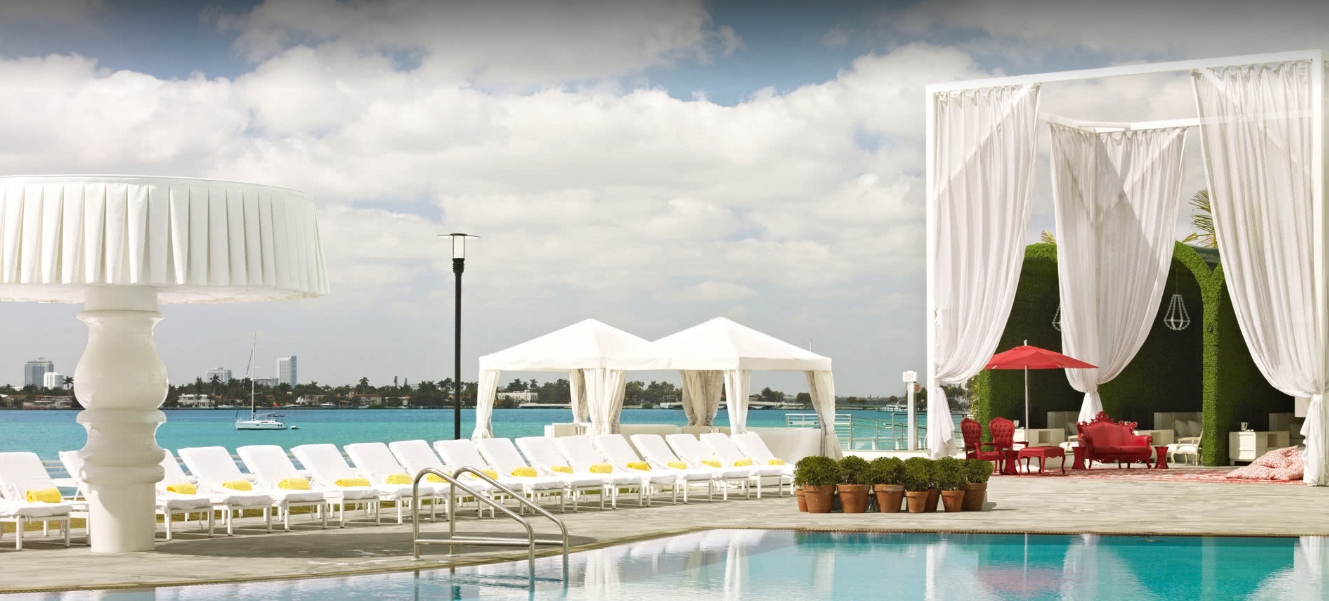
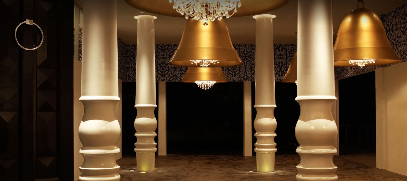
That said, credit where credit’s due. The pool area with stunning views of the Miami skyline and sunsets over Biscayne Bay are to die for. The oversized greenery clad cabanas, outdoor cinema, yoga deck and funky bar design are also a triumph, along with the huge doors to the lobby [that I want], the oversized-brass bell lights present throughout the common areas and the pretty etched walls of the lifts. For me it stops there.
The bedroom, initially exciting with giant framed orange tinted mirror, media section and quirky canvas print of a manga* style models face, cool blue delft tiles (an influence from the designers Dutch heritage), all share the same space as monochrome decorative surfaces, grey floor tiles and the odd chandelier. Touches of orange added vibrancy, but not enough to warm or pull the space together. Thus, it lacked cohesion for me. Its not that I don’t like quirky, dramatic, mismatch, or different even; quite the opposite, its just the space left me feeling cold and a tad bored of it after a short time. Not a feeling I intended or expected, but it can happen with very individual interiors. Sometimes it’s hard to put your finger on exactly why, but how a space makes you feel is probably the ultimate decider of success of a space.
Marcel Wanders’ work excites, provokes and polarises, but never fails to surprise, to celebrate and entertain. I’m just sad that on this occasion my most exciting design dreams didn’t come true.
* Manga have a unique visual language that conveys character and exaggerates reality.


